

Evaluative Research for Gift Hope:
A fundraising website where donors can choose their preferred charitable causes to donate
01
Objectives
Identify and evaluate the experience of using the Gift Hope website, especially usability problems in the user interface (UI) design, and providing suggestions to improve.
02
Heuristic Evaluation
A Heuristic Evaluation was conducted by 6 experts using Jakob Nielsen’s 10 heuristics for interface design and problem severity was rated according to Nielsen’s Method on a scale of 0 to 4. Recommendations were provided.
03
Usability Test
A formative usability test was conducted in order to identify usability problems of the Gift Hope website and to provide recommendations for redesign. Recommendations were provided
04
Results
Usability Issues are discussed along with other performance metrics. Recommendations are suggested based on the pain points.


Heuristic Evaluation
Task List
-
A master task list was created with 15 tasks for categorizing items
User Interface Focus
-
Navigation
-
Icon Intuitiveness
-
Content
-
Layout
-
Interaction
-
Other
Type of Problem
-
Local: A problem is in a single location, or multiple pages with the same structure
-
Global: A problem is on multiple pages with different structures, but the same content
Jakob Nielsen's 10 Heuristics
Visibility of system status | Match between system and the real world| User control and freedom| Consistency and standards| Error prevention| Recognition rather than recall| Flexibility and efficiency of use| Aesthetic and minimalist design| Help users recognize, diagnose, and recover from errors| Help and documentation
Evaluation Process
-
Each of 6 evaluators analyzed the tasks on the website and listed any problems based on their judgment and assigned the severity score from 1 to 4.
-
After listing, duplicates and any items that were agreed as not usability problems were removed.
-
All 6 evaluators scored all the items in the issues list using a the severity scale from 0-4. 0 was added for if an evaluator did not believe the identified issue was a usability problem at all.
-
After conducting average scores of 6 evaluators, the issues were sorted by UI focus, violations and severity.
-
Recommendations of each issue were provided.
-
Similarly, each evaluators found Keepers and assigned scores from 1 to 4 with 1 being least important to 4 being most important.
Nielsen's Method for Problem Severity
-
0 = I don’t agree this is a usability problem at all
-
1 = Cosmetic problem only
-
2= Minor Usability Problem
-
3= Major Usability Problem
-
4= Usability Catastrophe
Timeline
-
Two weeks for the end to end study


Example of the spreadsheet used for problem identifcation
KEEPERS

Clicking login function on the final page for donation, it will extend a space to for users to login.

Exhibit A
Exhibit B
When hovered over, the buttons change color providing a feedback of the system status


Register button becomes un-clickable when the password doesn't meet the requirement in form of Visibility of System Status.
Exhibit C
PROBLEMS & RECOMMENDATIONS

Exhibit A
When clicking in the “Donate with a group” option, it just shows the information about each group, but there isn’t an option to donate with them.
The user can only co-donate with a group once they are in the payment page, where they can choose the donation group.

Alternative #1: Add a text explanation: “If you want to donate with this group, select it as a Donor group in the checkout page”
Alternative #2: If a Shopping Cart is added, then it will show an option saying : “Apply this group to all my donations”
Alternative #3: Add a direct 'Donate' button


Exhibit B

On the "register for an account" page, there is no "re-enter password" box under the first "enter password" box. This is an industry standard for making sure the user doesn't misspell a password when first setting it (and isn’t forced to reset).
Add the compulsion section of re-entering password.


Exhibit C
The donation amounts are all fixed by the website, and users cannot decides an amount by their own.

Add a type area for users who want to input the amount defined by themselves

Usability Test
Intuitiveness
Comprehensible
Ease of Use
Satisfaction
Icon Intuitiveness
5 Tasks
6 Users
25 minutes


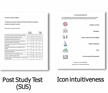


Demographic Data


Efficiency
Measured by time on task
Icon Intuitiveness
Measured by participants’ ability to match icons to their function
Effectiveness
Measured by task success rate
Usability Problems
Measured by participants’ comments, behaviors and answers to post-task and post-test interviews.
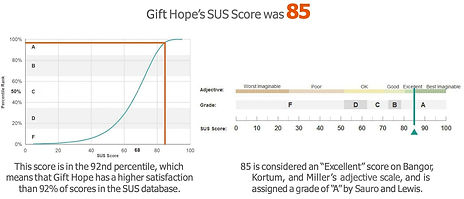
Satisfaction
Measured by survey results (SEQ and SUS) and comments


KEEPERS

Exhibit A

Majority of the users used the Search bar under Donate for charities when they wanted to look for a specific charity. For users who know the name of the charity they are looking for, this functionality is very useful.

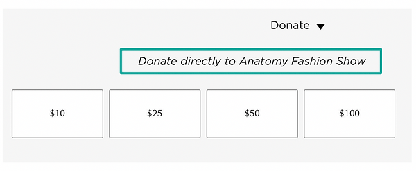
Exhibit B


After users open the Donate tab under, there is a line of words suggesting which program the user is donating to, which is beneficial for error prevention.
PROBLEMS AND RECOMMENDATIONS

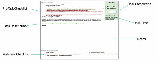
Example of Task Performance

Exhibit A

Exhibit B
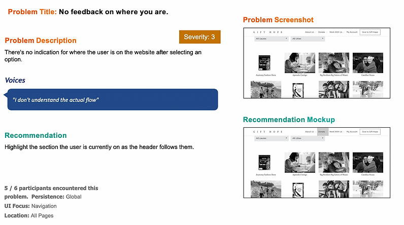
Exhibit C


Research Impact
-
Exploratory Research Requests
-
User empathy
Strategic Impact
-
Product strategy pivot to user-centric backed by research insights
-
Need for iterative research was established for strategies
Product Impact
-
Through collaboration, designers were able to quickly relay feedback from research and incorporate it to the new design
-
Design and visual components are currently being reused in the current website